
BeamUp! offers a comprehensive route planning platform that covers all modes of public transportation in Istanbul, including taxis.
This system enables users to discard public transportation choices they're not interested in and opt for taxi sharing, aiming to challenge established habits.
It empowers taxi users to explore alternative, eco-friendly, time-saving, and cost-effective options, termed the "Best Option," at each juncture.
Users can tailor their preferences by filtering based on financial considerations or time-saving priorities.
Designed in Figma
Duration: 4 weeks


Persona & User Flows
Derin
26 years old white-collar professional. A daily taxi commuter for work. Highly values time and convenience. Dislikes public transportation and bus rides. Introduced to "BeamUp!" by a coworker. Concerned about the cost of her daily taxi rides. Decides to install the app on a Sunday evening to explore cost-saving options. Initial interest in the app stems from curiosity and the potential to save money on taxi rides. Represents a user looking for a convenient and cost-effective alternative to daily taxi rides.
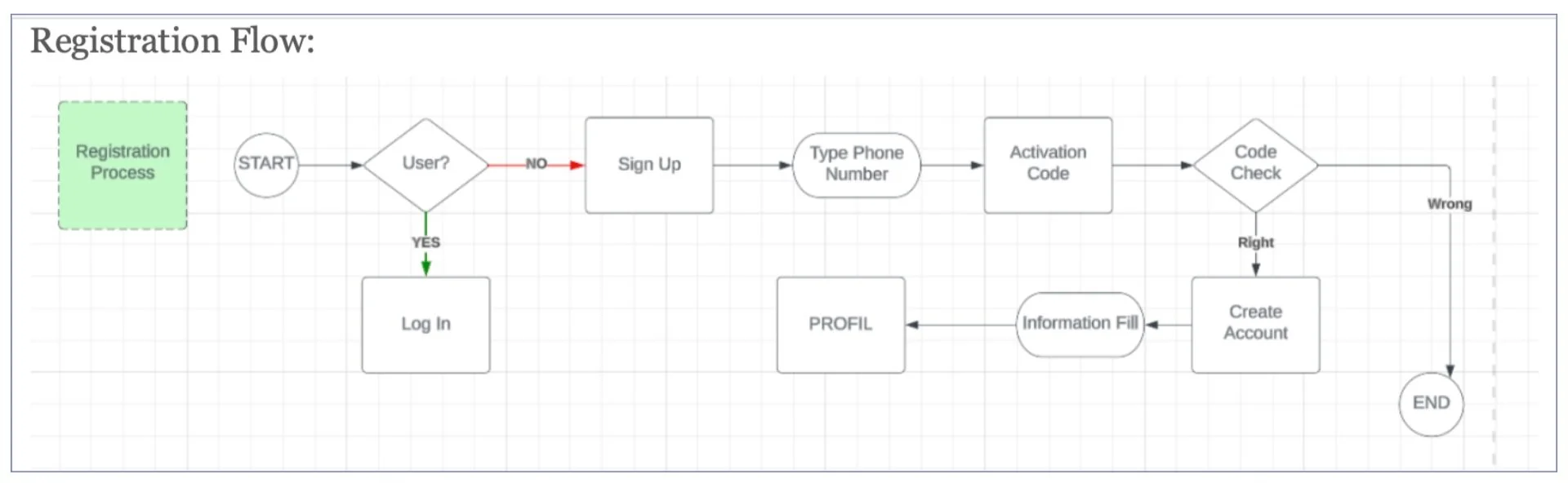
Mert
23-year-old senior university student. Frequent user of taxis, usually hails them near his home. Has already downloaded and set preferences in the BeamUp! app. Prioritizes speed and time efficiency when traveling. Often uses a taxi for quick and timely transportation. Prefers to see all available options at once. Values time as the top priority.


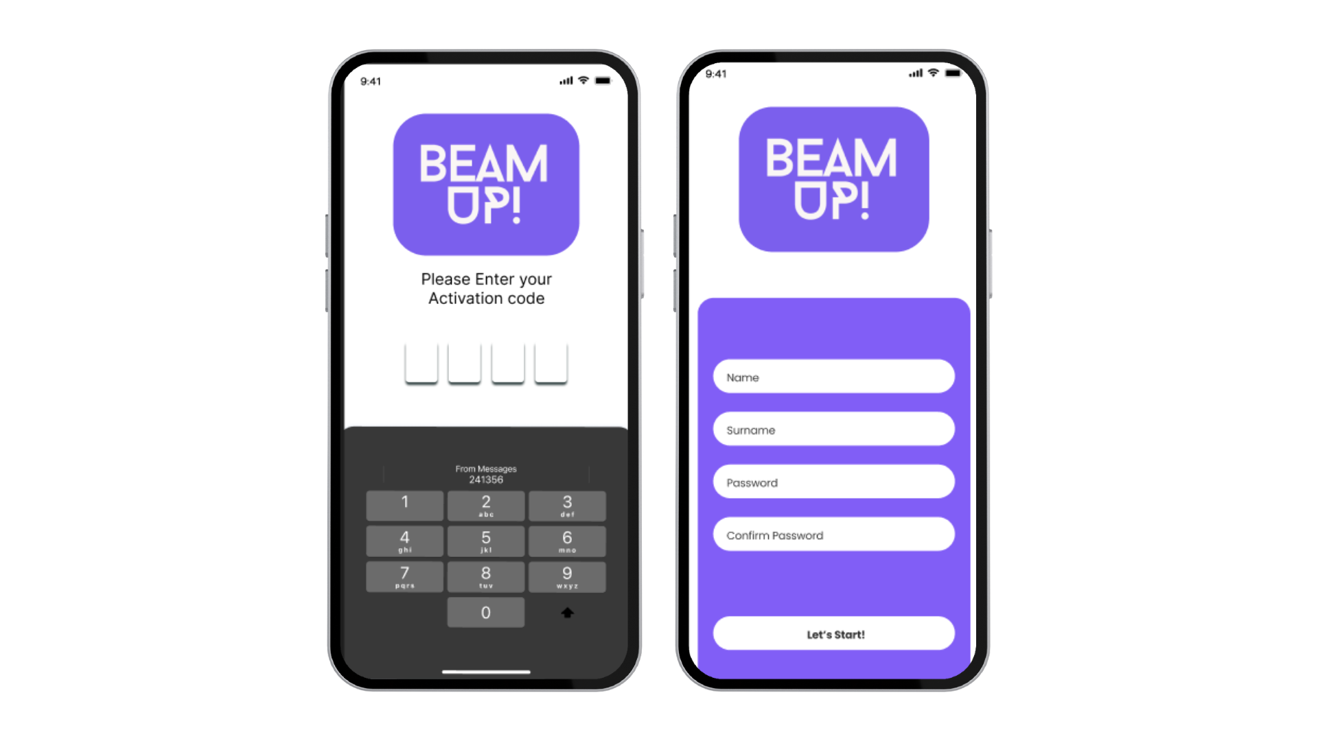
Sign Up & Login
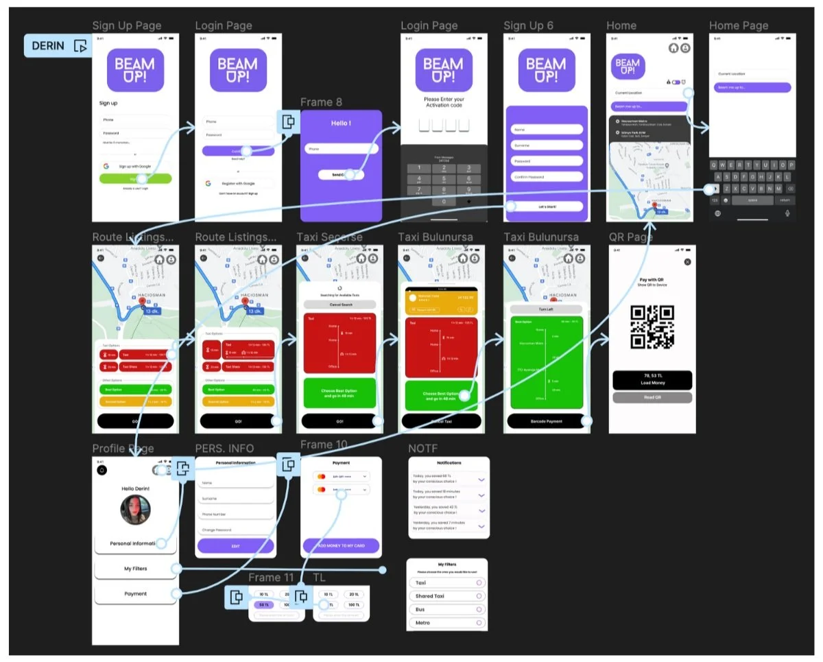
Final User Interface

Home & Search Page

Decision Alternatives & Best Option
Profile Page


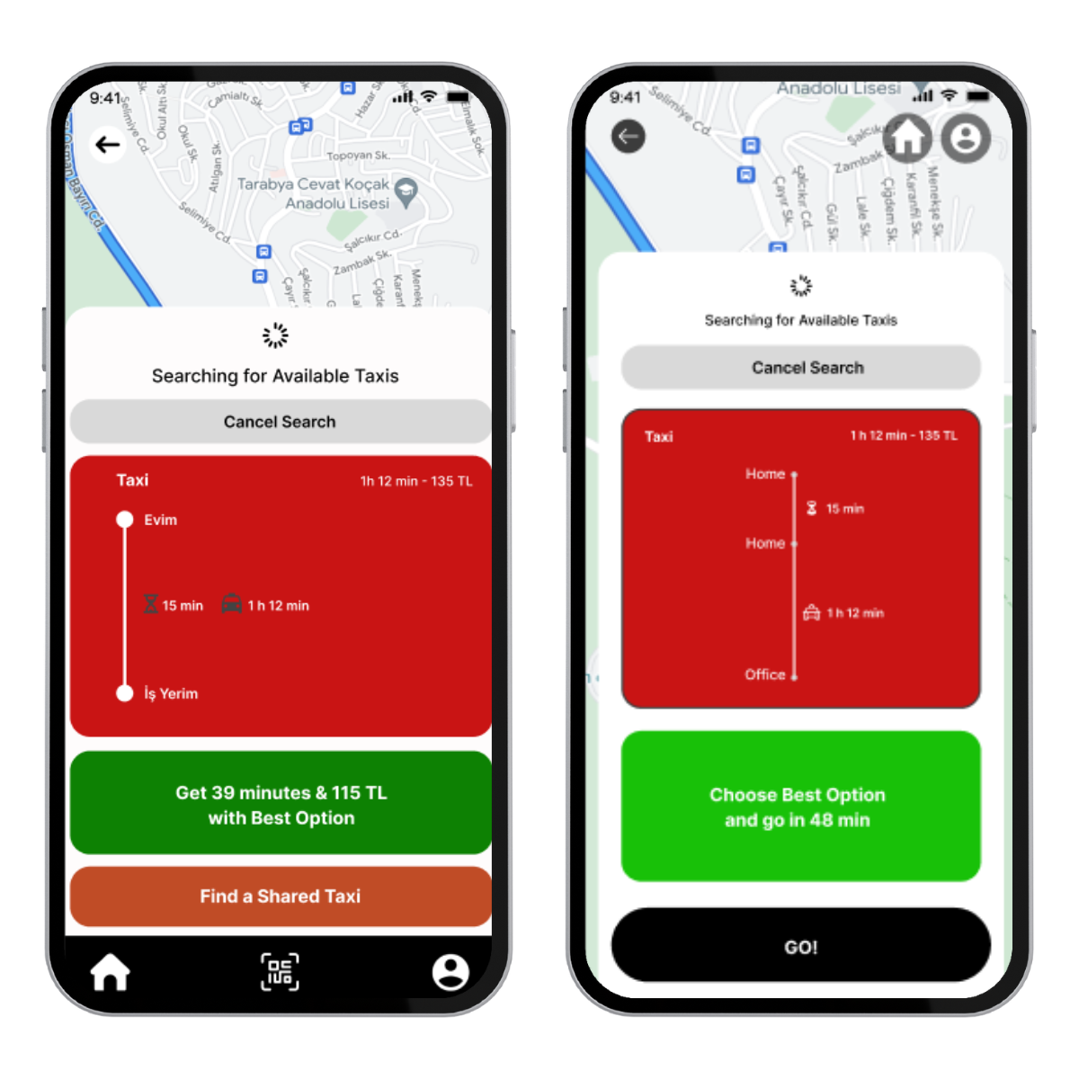
User Decision: Route and Mode Alternatives
In response to the valuable insights gained through user testing research, we have made significant enhancements to the two key pages of BeamUp!
Our primary goal has been to captivate users' attention and encourage them to explore the "Money" and "Time" choice buttons, which are the heart of our application.
Our commitment was to deliver an optimal route search experience that empowers users to make informed decisions based on their unique preferences, ensuring that both time and money are prioritized according to individual needs.
Another significant change we introduced before finalizing the project is the emphasis we placed on the "Best Option" segment within our user interface.
In every step of the journey, we made this section more prominent and visually appealing to ensure it captures users' attention and stands out as a preferred choice.
This change was implemented to make sure that users are fully aware of the most sustainable, cost-effective, and time-efficient option available to them.
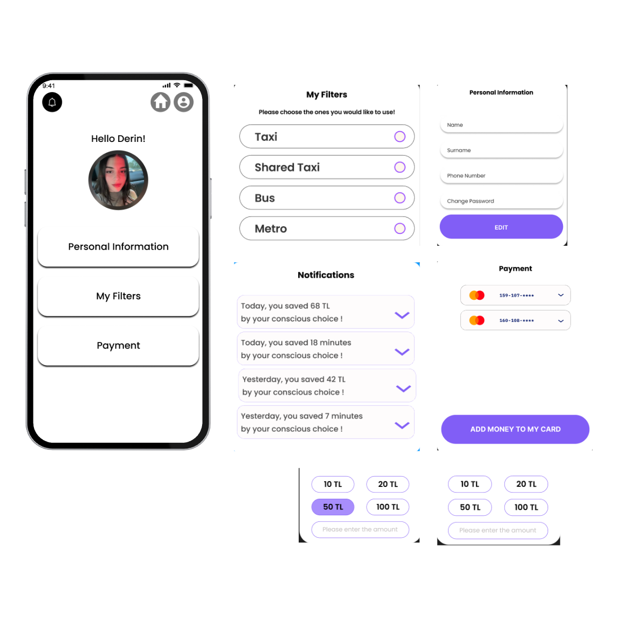
In response to insights gained from our latest user testing research, we made significant adjustments to our profile page to enhance user experience.
To streamline the interface and improve usability, we restructured the page by moving features like notifications, personal information, filters, and payment options into pop-up frames within the profile page.
This redesign aims to simplify the user journey and reduce the number of separate pages, providing a more intuitive and efficient experience for our users.
In our initial design, we incorporated a footer menu to provide users with quick access to essential features, including the QR payment option. However, during user testing, it became evident that the footer menu caused confusion among our users, particularly regarding how to make payments and add funds to their accounts.
To address this issue, we repositioned the payment option within the user profile page, allowing users to securely store their card information and conveniently top up their accounts.
Furthermore, we implemented a seamless QR payment process, where the payment QR code will appear as users select their mode of transportation, simplifying the payment experience.
These changes were made to enhance clarity and user-friendliness
